Here are 5 tools that are very helpful for Muse Designers, where you can simulate different devices and check the sites responsiveness, get inspiration or solve other problems that you may encounter.
1. Mydevice.io
If you are not sure what are your device’s values, just open this link in the device and you will get all the information. You will see screen metrics like size and pixel ratio, and browsers features. You can also check common smartphones and tablet values apart from yours.
Optimizilla is an online image optimizer. Upload up to 20 images at a time and compress them while keeping the level of quality of the picture. Upload JPEG and PNG images, and when it is done, click on the thumbnails and use the slider to control your compression. What is the advantage? On the left side you will see the original image and on the right side is how the same image looks like with compression. This way, you will always be able to compare both images.
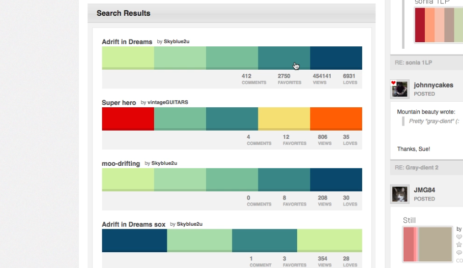
If you need inspiration or you are not sure what colors will look good together in you website, visit Colourlovers.com. It is a community where people from all around the world create and share colors, palettes and patterns.
You can also generate a palette starting from one color. Paste the Hex code and it will show all the palettes that contain that color.
This website allows you to view your website on a variety of device screens and resolutions. You just have to type in the URL and you can start testing how it will look in different desktop sizes, tablets and smartphones. It does not only work with live websites, you can also copy your Adobe Muse preview URL and view how your site will look like in a Kindle Fire or an iPad Air among others.
5. Google Chrome Inspector
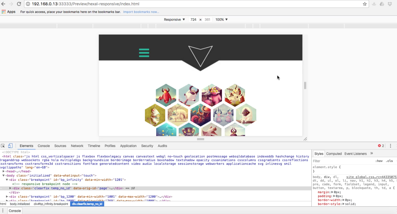
Chrome inspector is an alternative to Quirktools. It has the same function but instead of selecting the type of device, you can customize the height and the width by just dragging the sidebar.
To open the inspector in Chrome, right click over the website and select Inspector.
Usually you will need to add a code to your website so Chrome Inspector will show you page like it will look like in a real device. If you do not add the code, you will probably see blank spaces or you will experience problems related to page sizes.
In Adobe Muse go to Page -> Page properties -> Metadata
and paste this code in Html for <head> :
<meta name="viewport" content="width=device-width, initial-scale=1.0, maximum-scale=1.0, user-scalable=0">
Watch the video tutorial for more information.


