In this post you will find very helpful information for a better designing experience with Adobe Muse. Either you are a beginner or you have been using Muse for a while, you want to design quickly and solve issues fast. Here are what we consider useful tips for Adobe Muse users:
1. Anchor links
An anchor link is a link on a webpage that brings you to a specific spot on the page. You should always place your anchor links outside your canvas, in the grey area. If you place the anchor links on your design, it might create annoying blank spaces.
2. Hide in breakpoint/Hide in other breakpoints.
For usability reasons, you have to hide elements in smaller breakpoints. In smaller devices, you have to choose which elements to show or hide. You just have to right click on the element you want to hide and you will see two options:
- Hide in breakpoint: the element will hide in the current breakpoint.
- Hide in other breakpoints: the element will show in the current breakpoint but will be hidden in the rest of the breakpoints.
You can show or hide graphic elements, text and even widgets.
3. Formatting text in different breakpoints.
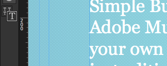
On the left column where you can find the tools, you can switch between a single capital T (which means that you will format the text in the current breakpoint so it will not affect the rest of the breakpoints) or four capital Ts (the formatting will affect all breakpoints).
This is an easy way to adjust the size of the text in smaller breakpoints.
4. Copy Text formatting to / Copy size and position to
You can copy your design to your different breakpoints with just one click. Right click over an element and click on Copy Text formatting to or Copy size and position to. You can select to copy to all breakpoints or to a specific one. This way, it will be faster to adjust your design to the different sizes.
5. Fix Viewport problem
When designing a web, sometimes you can see a blank space on the sides of your website. This means there is a problem with the viewport. The viewport is the user’s visible area of a web page. The viewport varies with the device, and will be smaller on a mobile phone than on a computer screen.
You just have to add the code to fix the annoying blank space. Go to Page -> Page properties -> Metadata
and paste this code in Html for <head> :
<meta name="viewport" content="width=device-width, initial-scale=1.0, maximum-scale=1.0, user-scalable=0">
Watch the tutorial for more information.


