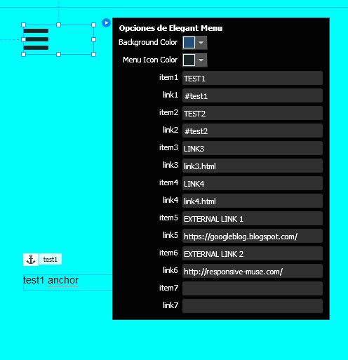
Now that you can create Responsive Designs in Adobe Muse and make our websites mobile-friendly, you have to think about the importance of the mobile elements like the menu.
On most desktop sites you find a horizontal menu that drop downs showing subpages. These menus are not thumb-friendly (which means that you are viewing the site with a tablet or phone). A “nav sandwich” or “nav burger” or the three horizontal lines is what we identify as a mobile menu.
We have designed a Responsive Elegant Mobile Menu Widget where you can include all your site pages and even external links. The menu opens and disappears with a gentle effect. You can customise the colours and the fonts and even the “nav burger” colours to match your website design.
HOWTO:
1. Start selecting a background color for your menu. A color selector will be displayed to help you.
2. Then choose the menu icon color, the color for the three lines that represent the mobile menu.
3. Add up to seven pages and external links
4. Name all your Muse pages. This is important because you have to write down the exact name of the page for the link, using lower case, followed by .html. For example, if you have named a page “services”, you must write “services.html”
5. You do not need to edit “index.html” as this will always be your homepage. You can rename the item if you want
Adobe Muse Responsive Menu Widget created by Responsive Muse.
- UPDATE: ELEGANT MENU V2 – Now working with anchor links, check anchor preview here
- UPDATE: ELEGANT MENU V3 – Now it lets you select if links will open in current or new window
- UPDATE: ELEGANT MENU V4 – Now you can customize menu text font and color.
- UPDATE: ELEGANT MENU V5 – Now you can set “Default” font and use any Typekit or web font selected in Adobe Muse.
[button link=”https://responsive-muse.com/demos/widget-elegantmenu/” color=”orange” size=”” stretch=”” type=”” shape=”” target=”_blank” title=”” gradient_colors=”|” gradient_hover_colors=”|” accent_color=”” accent_hover_color=”” bevel_color=”” border_width=”1px” icon=”” icon_divider=”yes” icon_position=”center” modal=”” animation_type=”0″ animation_direction=”down” animation_speed=”0.1″ alignment=”center” class=”” id=””]PREVIEW[/button]
Problems positioning overlayed widgets? read this


Melissa –
Love this menu
mirko –
thanks for anchor links update
Hax –
cool thx
TRShady –
best 5 bucks ever spent
Heather (verified owner) –
THANK YOU, THANK YOU, THANK YOU!!! I’m doing a HAPPY DANCE!!! I can’t tell you how much I appreciate your help and how quickly you helped me. I’m not good about giving reviews, but I had to leave one for ya’ll. This widget is GREAT and so is your customer service!
Ya’ll are the best!
responsive-muse (verified owner) –
We are so happy of seeing you happy! 🙂
Goran (verified owner) –
excellent widget, keep up the hard work! just one question: can you guys add more fonts? roboto and lato? cheers 🙂
responsive-muse (verified owner) –
Thank you very much 🙂 Sure, we will add it to next update. Stay tuned!
responsive-muse (verified owner) –
We just updated it. Now you can use any web font. We tried Roboto and Lato from Typekit and they are working nice. Please, go to “my account” and download it again. Thank you!
Jack (verified owner) –
What an awesome mobile menu…. I’ve shopped around many places for a widget like this and nothing has compared to it! It’s very simple to set up by adding page URL’s and of course like every other Responsive Muse widget, it’s fully customizable!
Andrew (verified owner) –
It isn’t often that you find any kind of developer that will go as far as the Responsive MUSE people did for me. You resolved my “Layers” issue and now my client is very happy with his website. Thanks again – J
Tanya –
Wasn’t sure if this would work for me, but now its compatible with anchor links so I can use in one page sites. Thanks for update!
Gerald –
its not so good and not too bad. I am missing that I can only add -7- links. I have a private concert homepage and need links to all the actors. These are more than 20. So I bought this one and be not stisfied with the description. It should be easy to add as much links as you need. So why is this artificial restricted? I got waht I need and therefore I will pay.
responsive-muse (verified owner) –
Hi Gerald.
This widget is designed to show all the links in a fullscreen page without scrolling. 20 links would probably need a very small font size and that may not be cool for the mobile users.
Also, Muse limits the amount of fields you can use in any widget settings, so we are forced to use a fixed number of links when developing it.
Anyway, since you are a premium user, feel free to use our support form and maybe our development team can find a solution that fits your needs.